# Use Google Drive to connect Dataset with library of 'googleDrive'
id <- "1nM0Cr-gVFF9UjvxSZXHNfFnrDWIUoTHi"
total_list <- read.csv(sprintf("https://docs.google.com/uc?id=%s&export=download", id))

# Filter out rows with non-numeric values in the 'streams' column
filtered_spotify_data <- total_list %>%
   filter(!grepl("[a-zA-Z]", streams))

# Sort the filtered dataset by the 'streams' column in descending order
sorted_filtered_spotify_data <- filtered_spotify_data %>%
  arrange(desc(streams))

# Create HTML view of Dataset
DT::datatable(head(sorted_filtered_spotify_data), editable = list(
  target = 'row', disable = list(columns = c(1, 3, 4))
))3 In Class 2
3.0.1 Most Streamed Spotify Songs 2023
The ‘Most Streamed Spotify Songs 2023’ dataset is a fantastic choice for class demos. It offers insights into the music industry by showcasing popular songs and their attributes. Students can explore the science of hit songs, understand their impact through social media analysis, and learn about cross-platform music data. It’s engaging and up-to-date, making it an excellent teaching resource.
3.0.2 Exercises for GGPLOT2
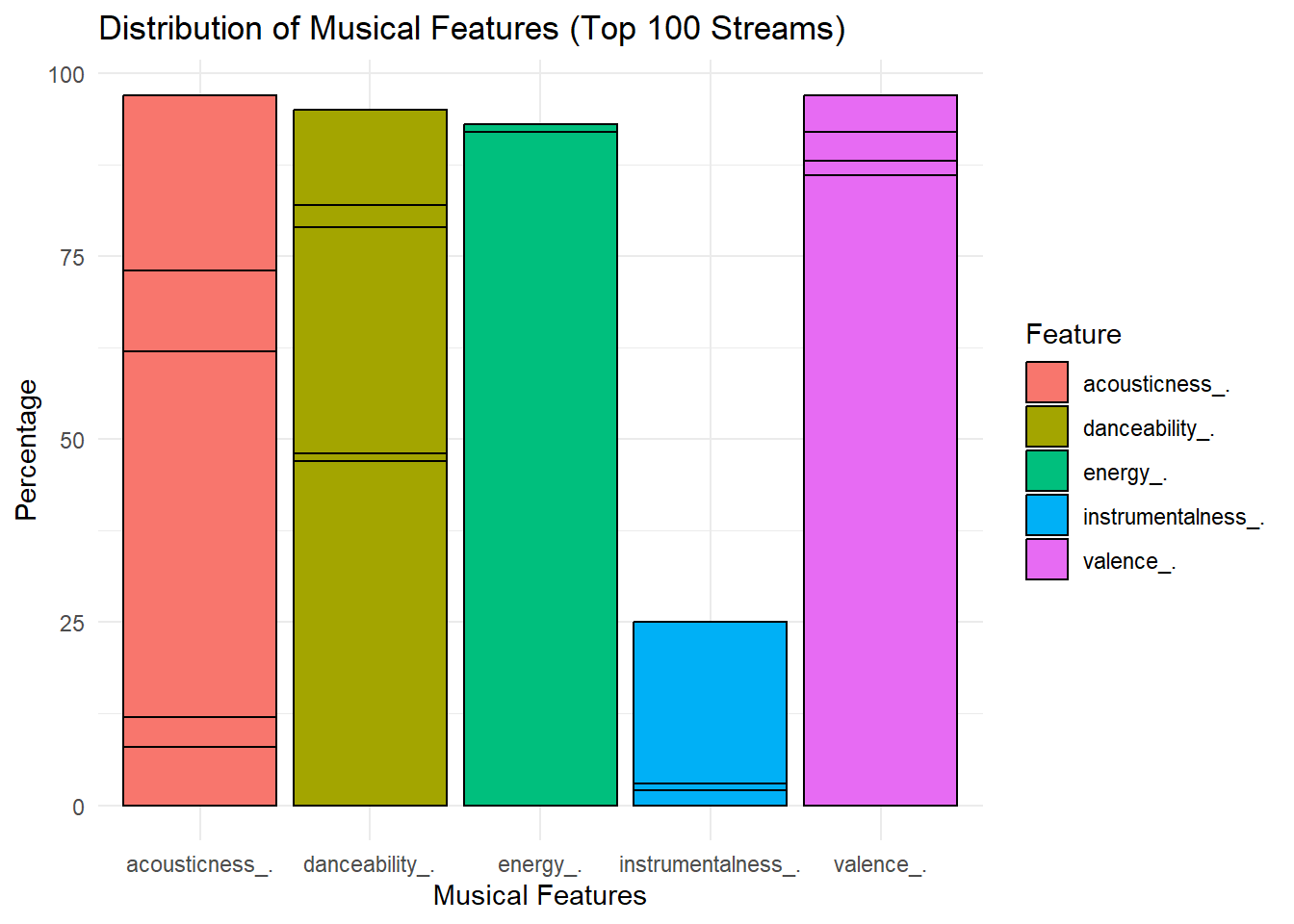
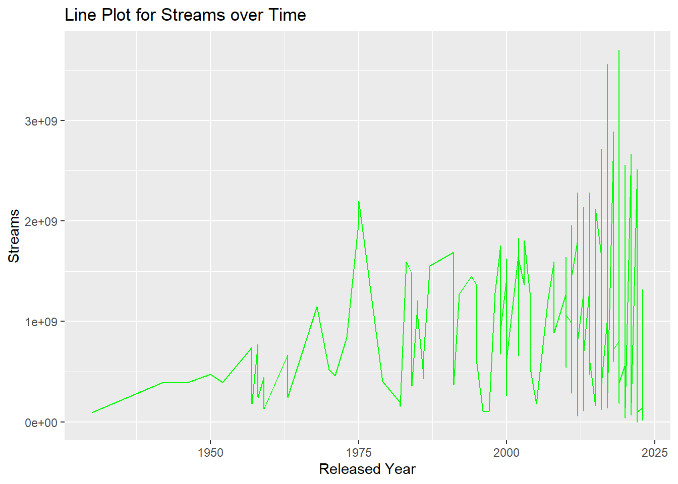
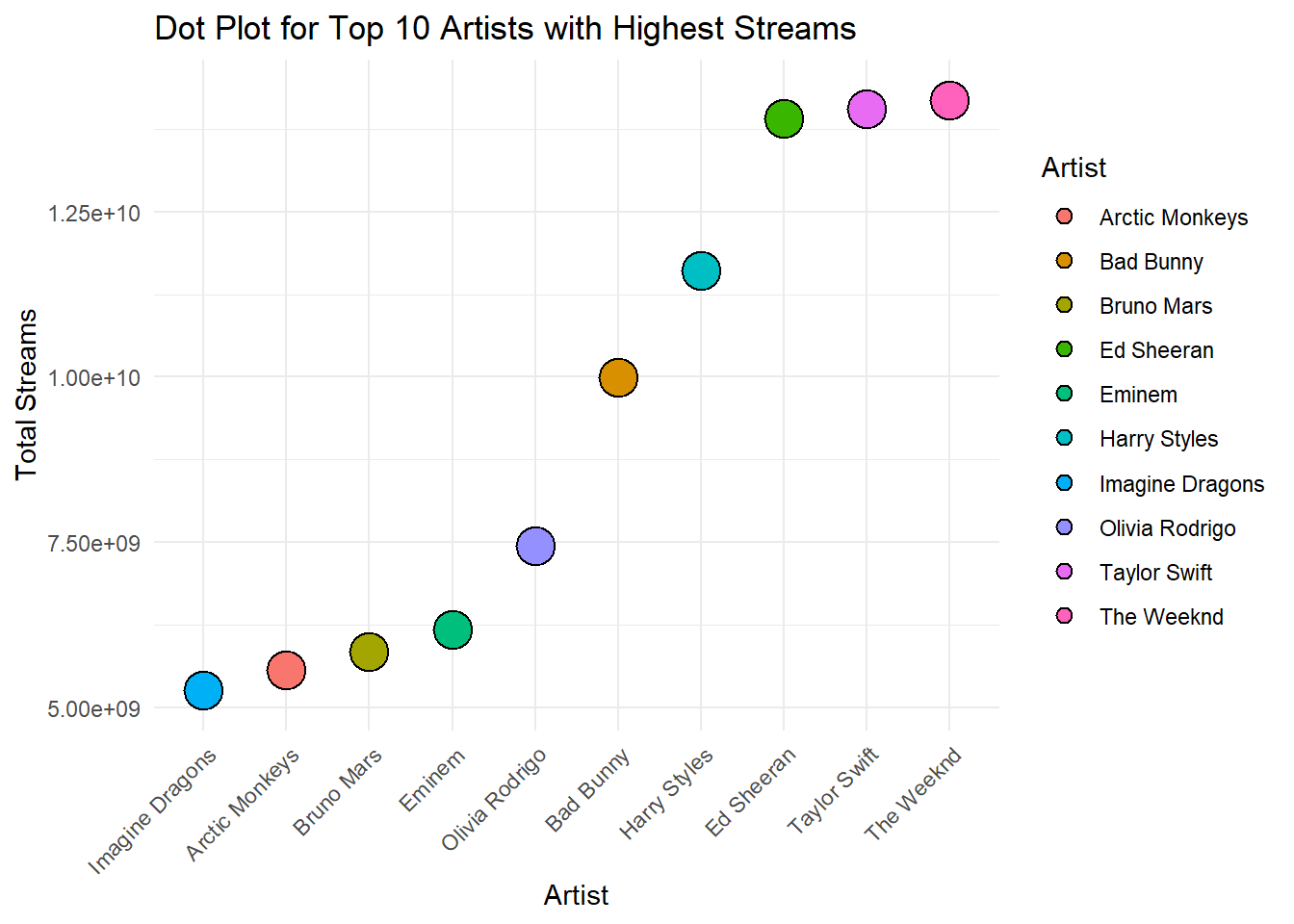
Practising the GGPLOT2, visualize Spotify data with three exercises. First, a bar chart illustrates the distribution of musical features. Second, a line plot depicts stream trends over time. Lastly, a dot plot showcases the top 10 artists with the highest streams, offering insights into their popularity.
class(filtered_spotify_data$streams)[1] "character"# Convert character to numeric , original r
filtered_spotify_data$streams <- as.numeric(filtered_spotify_data$streams)
# 1. Distribution of Musical Features
ordered_filtered_data <- filtered_spotify_data[order(-filtered_spotify_data$streams), ]
top100_streams_data <- head(ordered_filtered_data, 100)
gathered_top100_data <- gather(top100_streams_data, key = "feature", value = "percentage",
danceability_., valence_., energy_., acousticness_., instrumentalness_.)
ggplot(gathered_top100_data, aes(x = feature, y = percentage, fill = feature)) +
geom_bar(stat = "identity", position = "dodge", color = "black") +
labs(title = "Distribution of Musical Features (Top 100 Streams)",
x = "Musical Features",
y = "Percentage",
fill = "Feature") +
theme_minimal()
# 2. Line Plot for Streams over Time
ggplot(filtered_spotify_data, aes(x = released_year, y = streams, group = 1)) +
  geom_line(color = "green") +
  labs(title = "Line Plot for Streams over Time",
       x = "Released Year",
       y = "Streams")
# 3. Dot Plot for Top 10 Artists with Highest Streams

top_artists <- filtered_spotify_data %>%
  group_by(artist.s._name) %>%
  summarise(total_streams = sum(streams)) %>%
  top_n(10, total_streams)

ggplot(top_artists, aes(x = reorder(artist.s._name, total_streams), y = total_streams, fill = artist.s._name)) +
  geom_dotplot(binaxis = "y", stackdir = "center", dotsize = 2) +
  labs(title = "Dot Plot for Top 10 Artists with Highest Streams",
       x = "Artist",
       y = "Total Streams",
       fill = "Artist") +
  theme_minimal() +
  theme(axis.text.x = element_text(angle = 45, hjust = 1))
Bin width defaults to 1/30 of the range of the data. Pick better value with
`binwidth`.